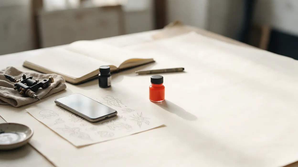
InkPoke looks different this week. If you've logged in recently, you've already seen it: the dark indigo screens are gone, replaced by warm paper, black ink and a single red-orange accent. Here is what changed, why we changed it, and what stayed exactly the same.
Why we changed it
The old InkPoke looked like most software: dark panels, purple buttons, cards inside cards. It worked, but it didn't look like it belonged in a tattoo studio. You spend your days making careful, deliberate marks. The tool that runs your bookings should feel closer to a sketchbook than to a spreadsheet.
So we rebuilt every screen around four rules:
- Paper and ink. A warm paper background in light mode, deep ink in dark mode. The app follows your phone's setting.
- One red button per screen. The vermilion button is always the next thing to do. Everything else is ink or outline, so you never have to hunt for it.
- Your work first. On your public page, the first thing a client sees is a piece you made.
- Fine lines instead of boxes. Less clutter, more room for what matters.
Today: the requests that need you, first
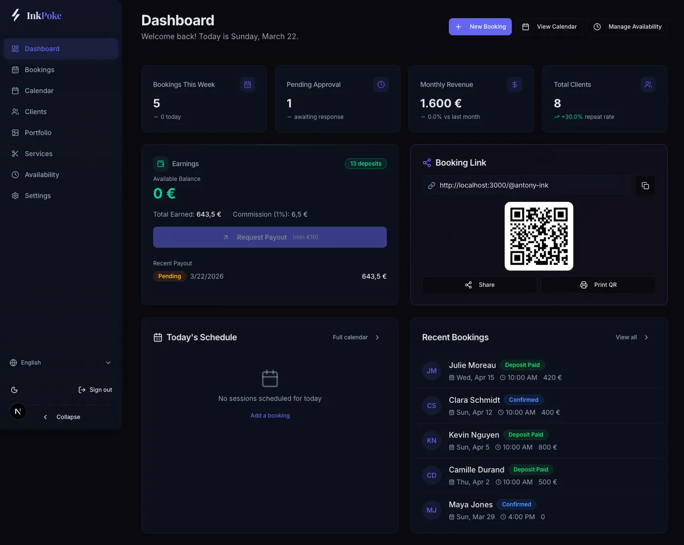
The old dashboard opened on four stat cards, an earnings panel and a QR code. Your new booking requests were further down, and on a phone, well below the fold.
Before
After
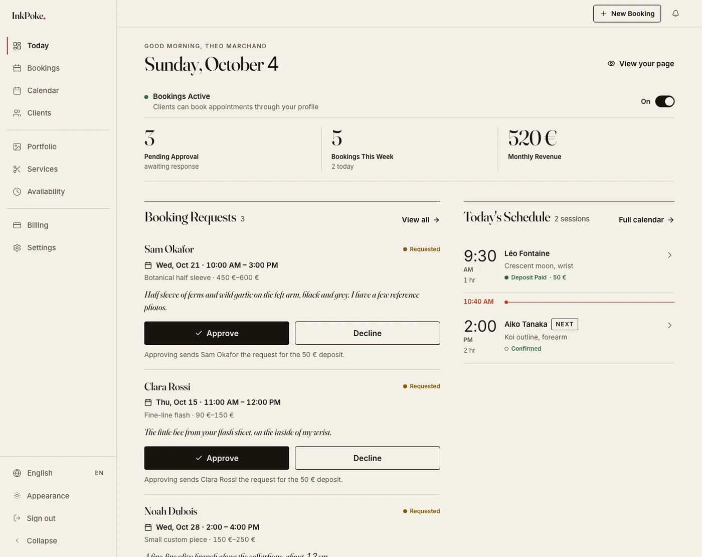
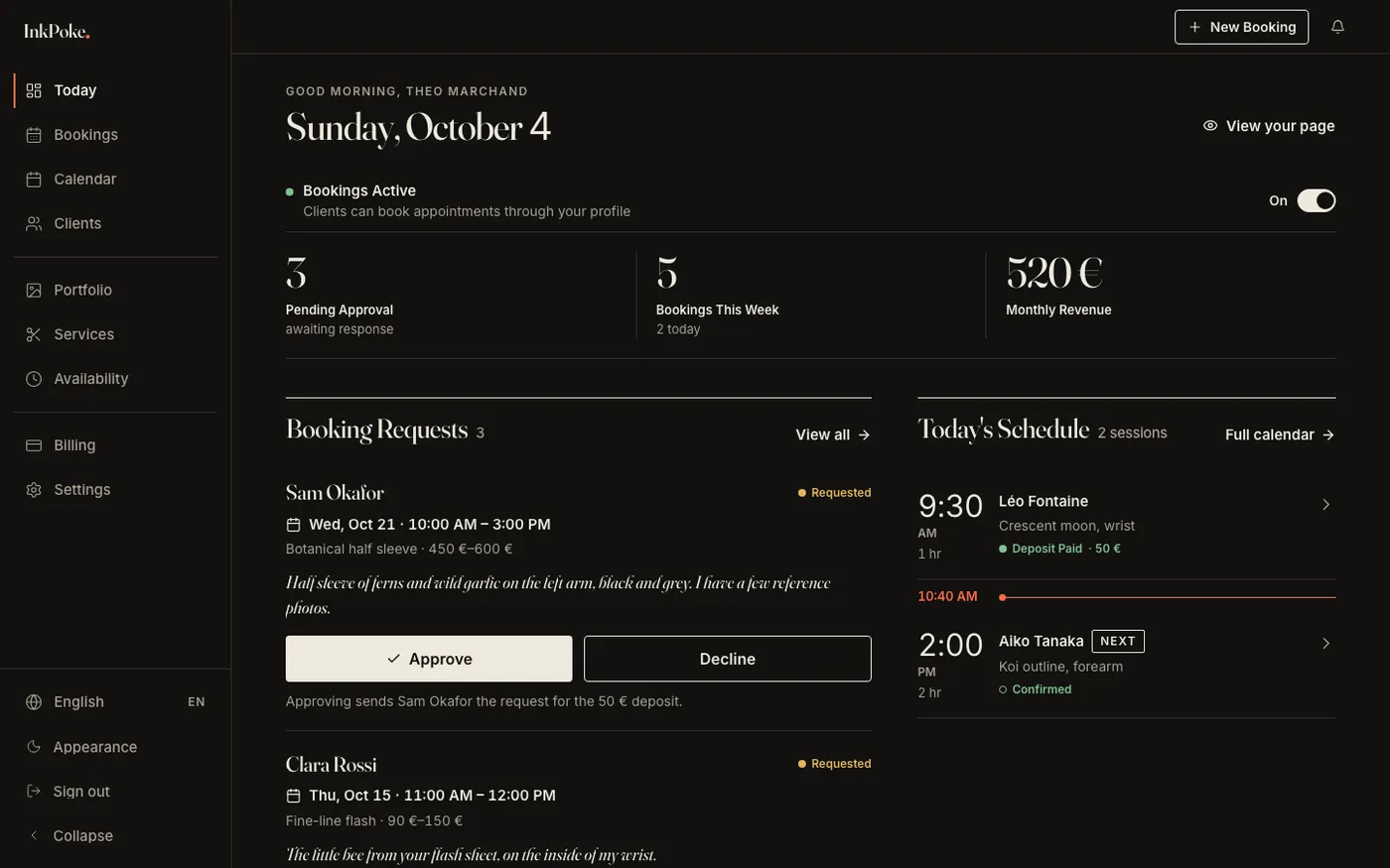
The new home screen, now called Today, puts pending requests first, with Approve and Decline right there. Under each request, one line tells you exactly what approving will do: that the client will be asked for their deposit, or that no deposit is needed. Approve is solid ink and Decline is an outline, so red never has to mean yes or no.
The calendar
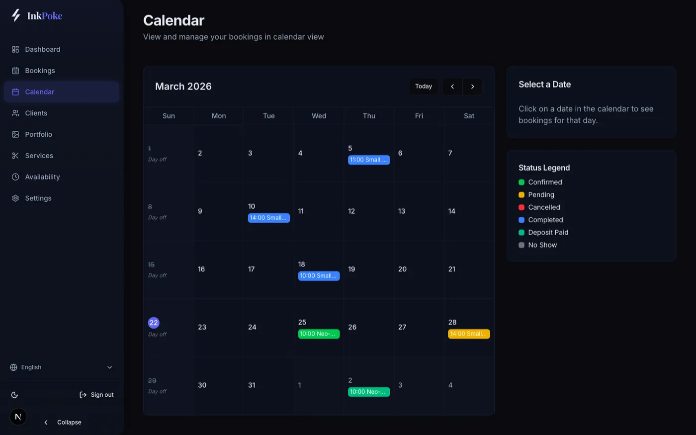
Before
After
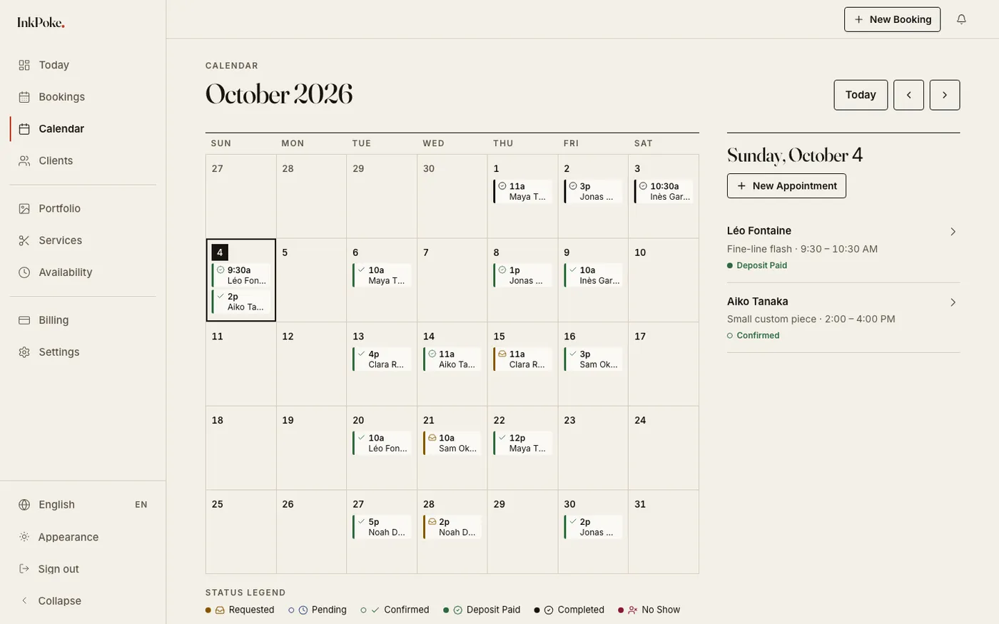
Same month view, calmer. Booking statuses across the app now read as a word with its own dot shape, not just a colour, so a confirmed session and a paid deposit are easy to tell apart. Times follow your language's format, and the calendar runs right to left in Arabic and Hebrew.
Your portfolio
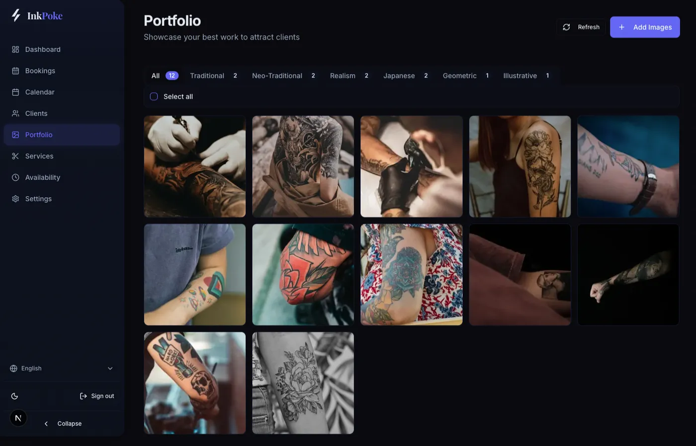
Before
After
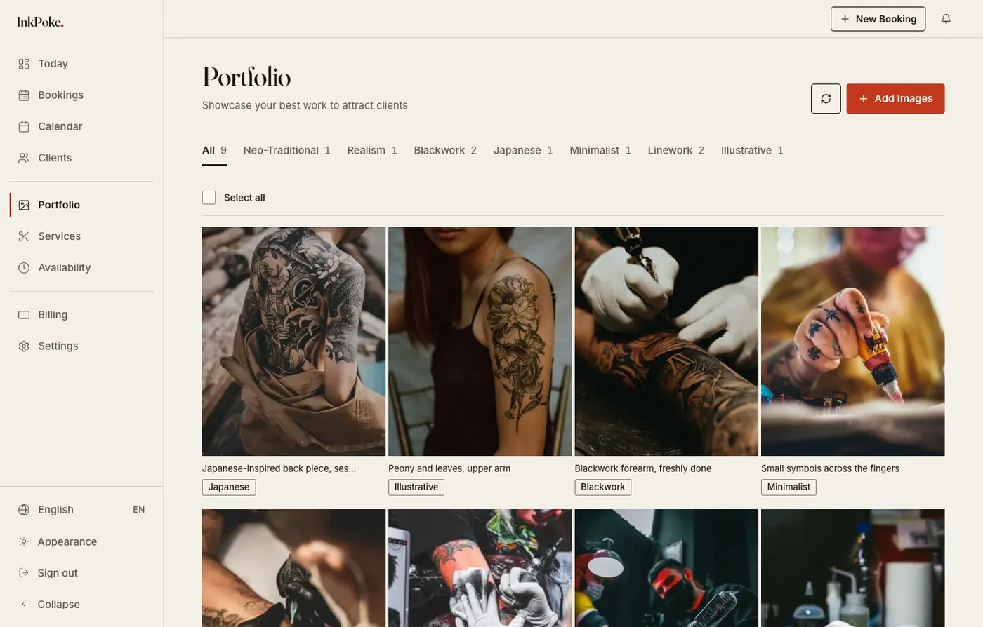
Your photos now sit on paper instead of a dark panel, in an even grid that lets the work speak. Uploading, captioning and tagging styles work exactly as before.
What your clients see
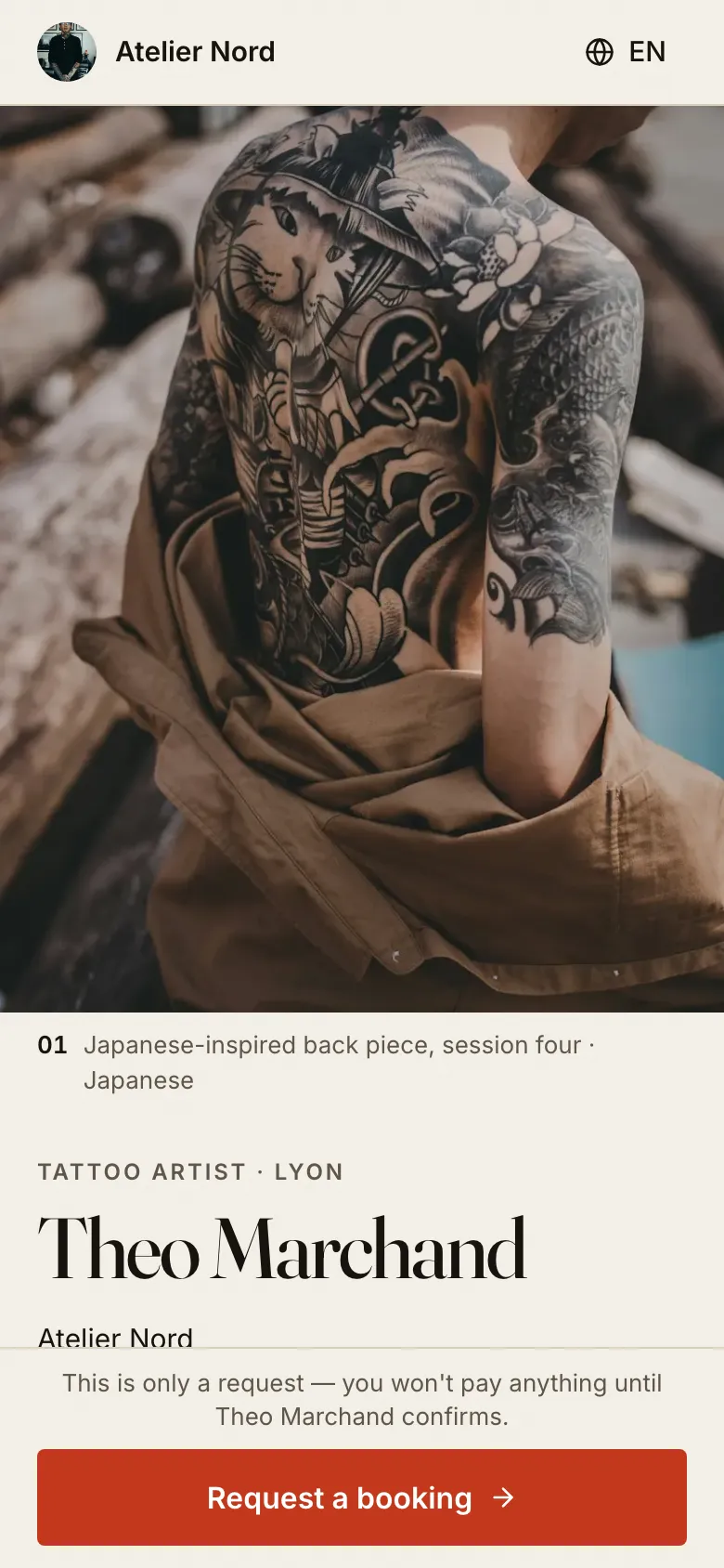
Your public page, inkpoke.com/@yourname, was redesigned too. On a phone, it now opens on your cover piece, then your name, your studio and your services laid out like a rate card. The gallery shows seven pieces and a "See all" link, so the page stays quick to scroll, and the booking button stays within reach at the bottom of the screen.
A shorter booking flow
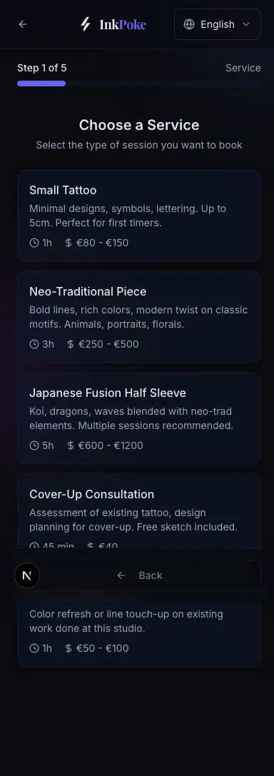
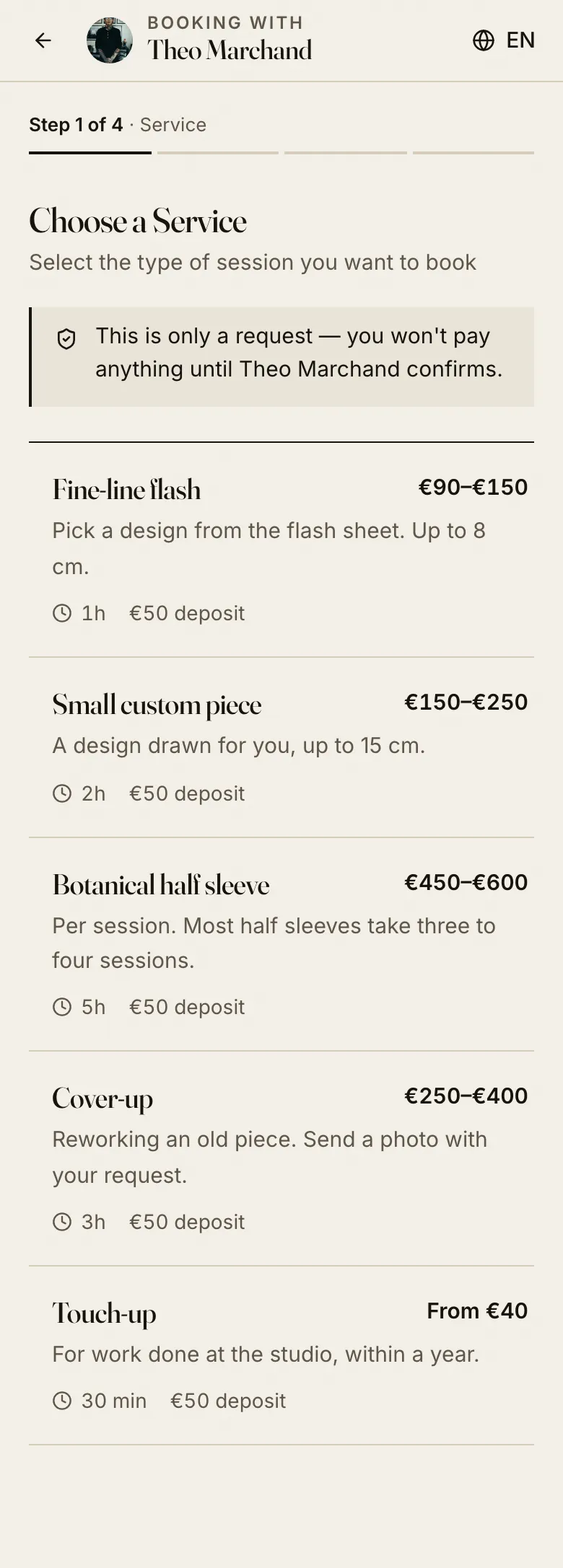
Booking used to take five steps. It now takes four: service, date and time, details, review. The date and the time are chosen on the same screen. Clients always see who they are booking with, the calendar speaks their language, and the page says plainly that a request costs nothing until you confirm it.
Before
After
Light and dark, in 33 languages
The whole app, from your dashboard to your public page and the booking flow, follows the light or dark setting of the device it's opened on. Every screen is available in the 33 languages InkPoke supports. The new pages are lighter, too: your public page now loads about a fifth less code than before.
What didn't change
- Your link, your clients, your bookings and your portfolio are exactly where you left them.
- Plans and prices are the same.
- Deposits work the same way.
- There's nothing to install or update. The new design is already live.
InkPoke is built by Wolf Dev Labs. If you're curious about the engineering side of this redesign, it's on the Wolf Dev Labs blog: This time the client was me.
If something looks off, or you miss something from the old version, write to hello@inkpoke.com. We read every message.